Quick summary for busy business owners.
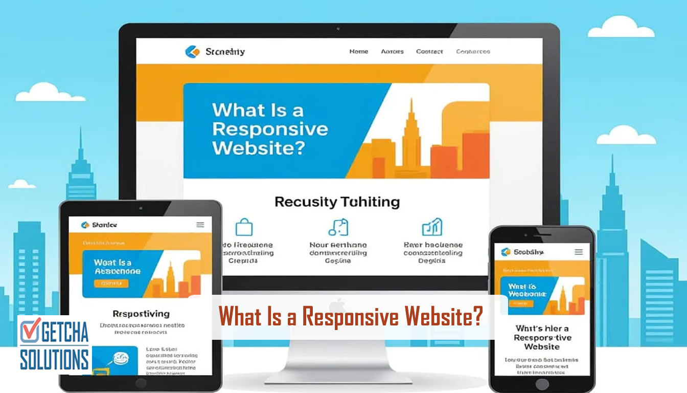
- A responsive website adjusts cleanly across mobile, tablet and desktop screens.
- For Singapore SMEs, mobile usability affects trust, enquiries, SEO and paid campaign results.
- Responsive design is not only shrinking a desktop page; it is planning content, buttons, images and forms for real mobile use.
- WhatsApp, phone links and forms should be easy to use on mobile because many enquiries start there.
A responsive website is a website that adapts to different screen sizes. It should look and work properly on desktop computers, laptops, tablets and mobile phones.
For a Singapore SME, this is not just a design detail. Many visitors will check your business on mobile first. If the page is hard to read, buttons are too small, images are awkward or the contact form is painful to use, the visitor may leave before contacting you.
Responsive does not mean simply shrinking the page
A common mistake is to design a desktop website first, then squeeze it into a mobile screen. That usually creates long pages, awkward spacing, tiny text and contact buttons that are difficult to tap.
Good responsive design considers how people browse on mobile. They scan faster, scroll more, tap with thumbs and often want quick actions like WhatsApp, call, map or enquiry form.
Why responsive design matters for enquiries
Your website may have good services and strong proof, but if mobile users cannot move easily through the page, the enquiry path breaks.
- Headings must be readable without zooming.
- Service sections should stack clearly on small screens.
- WhatsApp and phone buttons should be easy to tap.
- Forms should ask only for necessary details.
- Images should load quickly and not push important text too far down.
- Menus should be simple and reliable on mobile.
Responsive design and SEO
Search engines expect websites to work well on mobile. A slow or difficult mobile experience can affect engagement and search performance. Responsive design supports SEO because it helps visitors stay longer, understand the page and take action.
It also keeps your content in one URL instead of separate desktop and mobile pages, which is cleaner for indexing and maintenance.
What Singapore SMEs should check
Open your website on your own phone and test it like a customer. Can you understand what the business does within a few seconds? Can you find services? Can you see proof? Can you contact the business without frustration?
Also test the navigation menu, contact form, WhatsApp button, page speed and image layout. These small details affect whether the visitor trusts the business.
Final advice
A responsive website should make your business easy to understand and easy to contact on every screen size. It is not only a technical checkbox. It is part of conversion, credibility and search visibility.
Need your website checked on mobile?
Send your current website. I can point out mobile layout, speed, trust and enquiry-flow issues that may be costing leads.
Request a website review View website servicesCommon questions about this topic.
What is a responsive website?
A responsive website adjusts its layout, images, text and navigation so it works properly on desktop, tablet and mobile screens.
Does responsive design help SEO?
Yes. A mobile-friendly website supports better user experience, engagement and search visibility.
Why is responsive design important in Singapore?
Many Singapore customers browse and contact businesses through mobile phones, so a poor mobile experience can reduce trust and enquiries.